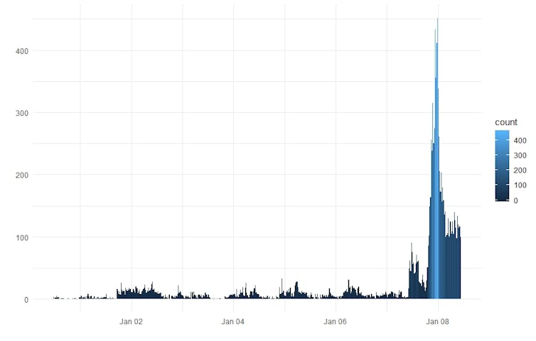
6 things to ask yourself before you share a bushfire map on social media


NASA’s Worldview software gives you a satellite view of Earth right now, and can help track the spread of fires.
Nasa Worldview

Juan Pablo Guerschman, CSIRO

In recent days, many worrying bushfire maps have been circulating online, some appearing to suggest all of Australia is burning.

You might have seen this example, decried by some as misleading, prompting this Instagram post by its creator:

As he explained, the image isn’t a NASA photo. What a satellite actually “sees” is quite different.

I’ll explain how we use data collected by satellites to estimate how much of an area is burning, or has already been burnt, and what this information should look like once it’s mapped.


Read more:
A crisis of underinsurance threatens to scar rural Australia permanently


Reflective images

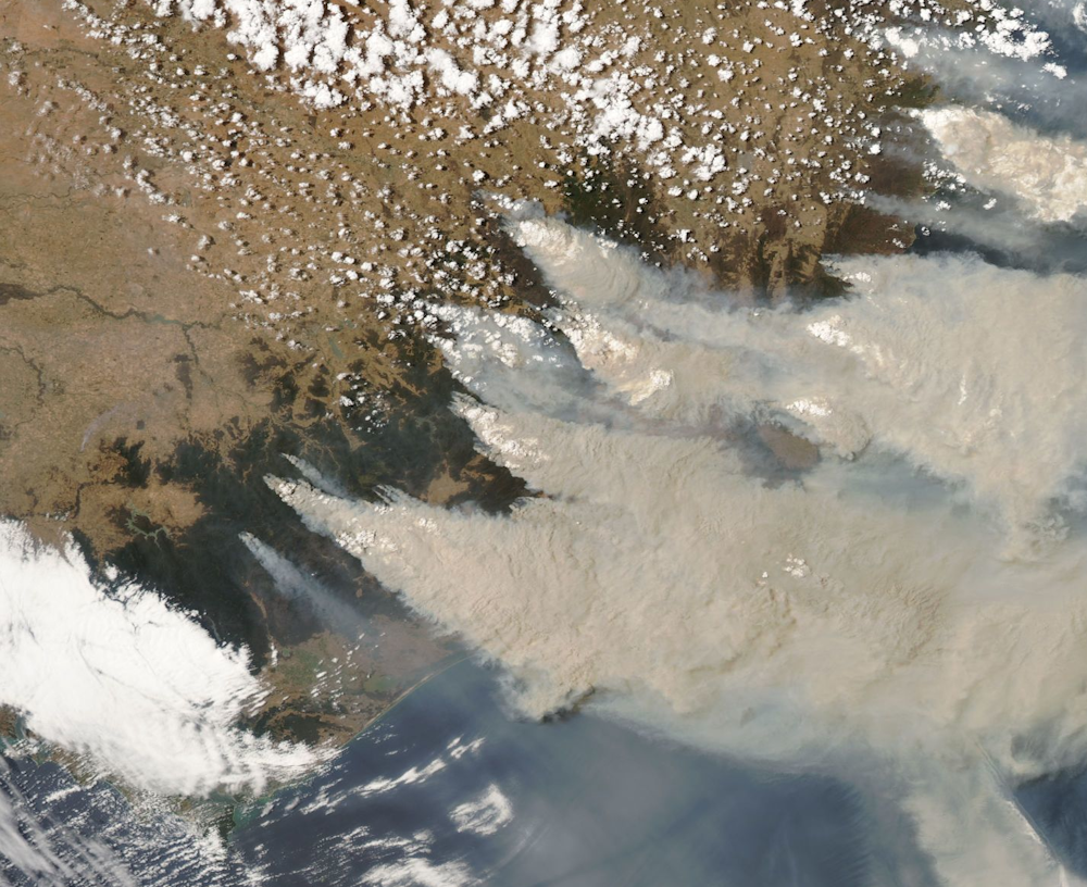
When astronauts look out their window in space, this is what they see:

It’s similar to what you might see from an aeroplane window, but higher and covering a wider area.

As you read this, many unmanned satellites are orbiting and photographing Earth. These images are used to monitor fires in real-time. They fall into two categories: reflective and thermal.

Reflective images capture information in the visible range of the electromagnetic spectrum (in other words, what we can see). But they also capture information in wavelengths we can’t see, such as infrared wavelengths.

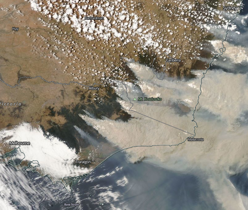
If we use only the visible wavelengths, we can render the image similar to what we might see with the naked eye from a satellite. We call these “true colour” images.

This is a true colour image of south-east Australia, taken on January 4th 2020 from the MODIS instrument on the Aqua satellite. Fire smoke is grey, clouds are white, forests are dark green, brown areas are dryland agricultural areas, and the ocean is blue.
NASA Worldview / https://go.nasa.gov/307pDDX

Note that the image doesn’t have political boundaries, as these aren’t physical features. To make satellite imagery useful for navigation, we overlay the map with location points.

The same image shown as true colour, with the relevant geographical features overlaid.
NASA Worldview / https://go.nasa.gov/2TafEMH

From this, we can predict where the fires are by looking at the smoke. However, the fires themselves are not directly visible.

‘False colour’ images

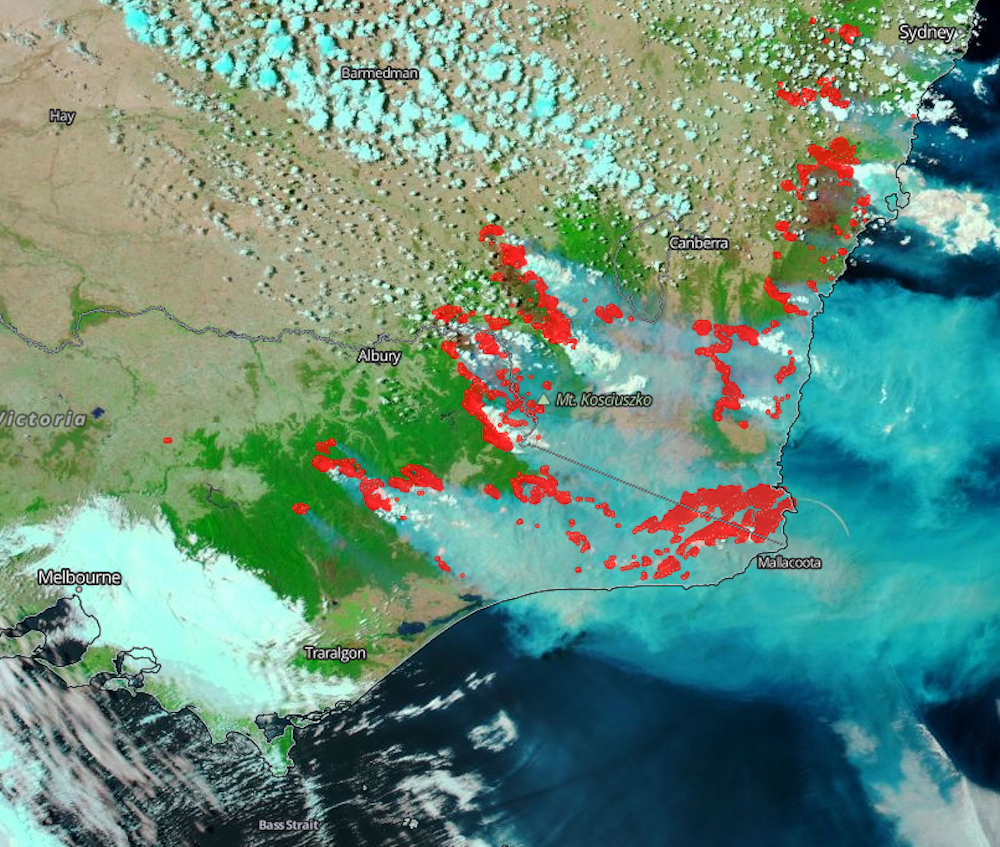
Shortwave infrared bands are less sensitive to smoke and more sensitive to fire, which means they can tell us where fire is present.

Converting these wavelengths into visible colours produces what we call “false colour” images. For instance:

The same image, this time shown as false colour. Now, the fire smoke is partially transparent grey while the clouds aren’t. Red shows the active fires and brown shows where bushfires have recently burnt.
NASA Worldview / https://go.nasa.gov/2NhzRfN

In this shortwave infrared image, we start to “see” under the smoke, and can identify active fires. We can also learn more about the areas that are already burnt.

Thermal and hotspots

As their name suggests, thermal images measure how hot or cold everything in the frame is. Active fires are detected as “hotspots” and mapped as points on the surface.

While reflective imagery is only useful when obtained by a satellite during daytime, thermal hotspots can be measured at night – doubling our capacity to observe active fires.

The same image shown as false color, with hotspots overlaid in red.
NASA Worldview / https://go.nasa.gov/2rZNIj9

This information can be used to create maps showing the aggregation of hotspots over several days, weeks or months.

Geoscience Australia’s Digital Earth hotspots service shows hotspots across the continent in the last 72 hours. It’s worth reading the “about” section to learn the limitations or potential for error in the map.


Read more:
Spread the word: the value of local information in disaster response


When hotspots, which show “hot” pixels, are shown as extremely big icons, or are collected over long periods, the results can be deceiving. They can indicate a much larger area to be under fire than what is really burning.

For example, it would be wrong to believe all the areas in red in the map below are burning or have already burnt. It’s also unclear over what period of time the hotspots were aggregated.

The ‘world map of fire hotspots’ from the Environmental Investigation Agency.
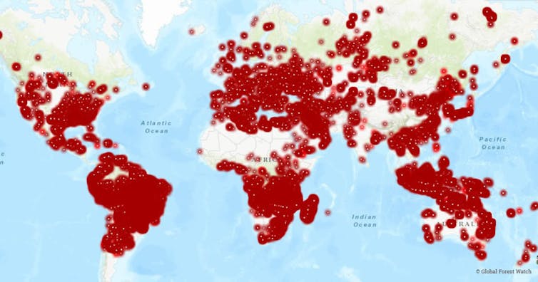
Environmental Investigation Agency / https://eia-international.org/news/watching-the-world-burn-fires-threaten-the-worlds-tropical-forests-and-millions-of-people/

Get smart

Considering all of the above, there are some key questions you can ask to gauge the authenticity of a bushfire map. These are:

  • Where does this map come from, and who produced it?

  • is this a single satellite image, or one using hotspots overlaid on a map?

  • what are the colours representing?

  • do I know when this was taken?

  • if this map depicts hotspots, over what period of time were they collected? A day, a whole year?

  • is the size of the hotspots representative of the area that is actually burning?

So, the next time you see a bushfire map, think twice before pressing the share button.The Conversation

Juan Pablo Guerschman, Senior Research Scientist, CSIRO

This article is republished from The Conversation under a Creative Commons license. Read the original article.

Bushfires, bots and arson claims: Australia flung in the global disinformation spotlight


Timothy Graham, Queensland University of Technology and Tobias R. Keller, Queensland University of Technology

In the first week of 2020, hashtag #ArsonEmergency became the focal point of a new online narrative surrounding the bushfire crisis.

The message: the cause is arson, not climate change.

Police and bushfire services (and some journalists) have contradicted this claim.

We studied about 300 Twitter accounts driving the #ArsonEmergency hashtag to identify inauthentic behaviour. We found many accounts using #ArsonEmergency were behaving “suspiciously”, compared to those using #AustraliaFire and #BushfireAustralia.

Accounts peddling #ArsonEmergency carried out activity similar to what we’ve witnessed in past disinformation campaigns, such as the coordinated behaviour of Russian trolls during the 2016 US presidential election.

Bots, trolls and trollbots

The most effective disinformation campaigns use bot and troll accounts to infiltrate genuine political discussion, and shift it towards a different “master narrative”.

Bots and trolls have been a thorn in the side of fruitful political debate since Twitter’s early days. They mimic genuine opinions, akin to what a concerned citizen might display, with a goal of persuading others and gaining attention.

Bots are usually automated (acting without constant human oversight) and perform simple functions, such as retweeting or repeatedly pushing one type of content.

Troll accounts are controlled by humans. They try to stir controversy, hinder healthy debate and simulate fake grassroots movements. They aim to persuade, deceive and cause conflict.

We’ve observed both troll and bot accounts spouting disinformation regarding the bushfires on Twitter. We were able to distinguish these accounts as being inauthentic for two reasons.

First, we used sophisticated software tools including tweetbotornot, Botometer, and Bot Sentinel.

There are various definitions for the word “bot” or “troll”. Bot Sentinel says:

Propaganda bots are pieces of code that utilize Twitter API to automatically follow, tweet, or retweet other accounts bolstering a political agenda. Propaganda bots are designed to be polarizing and often promote content intended to be deceptive… Trollbot is a classification we created to describe human controlled accounts who exhibit troll-like behavior.

Some of these accounts frequently retweet known propaganda and fake news accounts, and they engage in repetitive bot-like activity. Other trollbot accounts target and harass specific Twitter accounts as part of a coordinated harassment campaign. Ideology, political affiliation, religious beliefs, and geographic location are not factors when determining the classification of a Twitter account.

These machine learning tools compared the behaviour of known bots and trolls with the accounts tweeting the hashtags #ArsonEmergency, #AustraliaFire, and #BushfireAustralia. From this, they provided a “score” for each account suggesting how likely it was to be a bot or troll account.

We also manually analysed the Twitter activity of suspicious accounts and the characteristics of their profiles, to validate the origins of #ArsonEmergency, as well as the potential motivations of the accounts spreading the hashtag.

Who to blame?

Unfortunately, we don’t know who is behind these accounts, as we can only access trace data such as tweet text and basic account information.

This graph shows how many times #ArsonEmergency was tweeted between December 31 last year and January 8 this year:

On the vertical axis is the number of tweets over time which featured #ArsonEmergency. On January 7, there were 4726 tweets.
Author provided

Previous bot and troll campaigns have been thought to be the work of foreign interference, such as Russian trolls, or PR firms hired to distract and manipulate voters.

The New York Times has also reported on perceptions that media magnate Rupert Murdoch is influencing Australia’s bushfire debate.


Read more:
Weather bureau says hottest, driest year on record led to extreme bushfire season


Weeding-out inauthentic behaviour

In late November, some Twitter accounts began using #ArsonEmergency to counter evidence that climate change is linked to the severity of the bushfire crisis.

Below is one of the earliest examples of an attempt to replace #ClimateEmergency with #ArsonEmergency. The accounts tried to get #ArsonEmergency trending to drown out dialogue acknowledging the link between climate change and bushfires.

We suspect the origins of the #ArsonEmergency debacle can be traced back to a few accounts.
Author provided

The hashtag was only tweeted a few times in 2019, but gained traction this year in a sustained effort by about 300 accounts.

A much larger portion of bot and troll-like accounts pushed #ArsonEmergency, than they did #AustraliaFire and #BushfireAustralia.

The narrative was then adopted by genuine accounts who furthered its spread.

On multiple occasions, we noticed suspicious accounts countering expert opinions while using the #ArsonEmergency hashtag.

The inauthentic accounts engaged with genuine users in an effort to persuade them.
author provided

Bad publicity

Since media coverage has shone light on the disinformation campaign, #ArsonEmergency has gained even more prominence, but in a different light.

Some journalists are acknowledging the role of disinformation bushfire crisis – and countering narrative the Australia has an arson emergency. However, the campaign does indicate Australia has a climate denial problem.

What’s clear to me is that Australia has been propelled into the global disinformation battlefield.


Read more:
Watching our politicians fumble through the bushfire crisis, I’m overwhelmed by déjà vu


Keep your eyes peeled

It’s difficult to debunk disinformation, as it often contains a grain of truth. In many cases, it leverages people’s previously held beliefs and biases.

Humans are particularly vulnerable to disinformation in times of emergency, or when addressing contentious issues like climate change.

Online users, especially journalists, need to stay on their toes.

The accounts we come across on social media may not represent genuine citizens and their concerns. A trending hashtag may be trying to mislead the public.

Right now, it’s more important than ever for us to prioritise factual news from reliable sources – and identify and combat disinformation. The Earth’s future could depend on it.The Conversation

Timothy Graham, Senior lecturer, Queensland University of Technology and Tobias R. Keller, Visiting Postdoc, Queensland University of Technology

This article is republished from The Conversation under a Creative Commons license. Read the original article.