
Tag Archives for space
Mangroves from space: 30 years of satellite images are helping us understand how climate change threatens these valuable forests
Travel Sourced, Pixabay, CC BY-SA
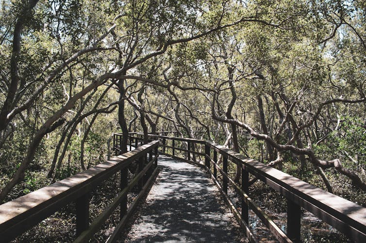
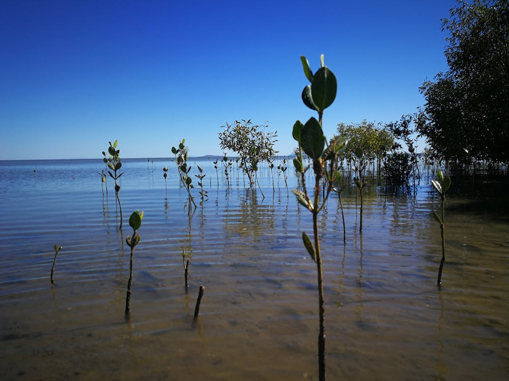
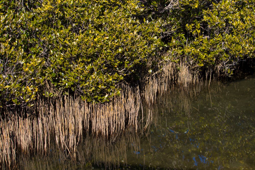
Nicolás Younes Cárdenas, James Cook University; Karen Joyce, James Cook University, and Stefan W Maier, James Cook UniversityAustralia is home to around 2% of the world’s mangrove forests and is the fifth most mangrove-forested country on Earth. Mangroves play a crucial role in the ecosystem thanks to the dizzying array of plants, animals and birds they feed, house and protect.
Mangrove forests help protect coastal communities from cyclones and storms by absorbing the brunt of a storm’s energy. They help our fight against climate change by storing vast amounts of carbon that would otherwise be released as greenhouse gases.
In other words, mangroves are some of our most precious ecosystems. Despite their importance, there is much we don’t know about these complex wetland forests. For example, when does their growing season start? And, how long does it last?
Usually, answering these types of questions requires frequent data collection in the field, but that can be costly and time-consuming. An alternative is to use satellite images. In the future, this will allow us to track the impacts of climate change on mangroves and other forests.
Nicolas Younes
What is phenology?
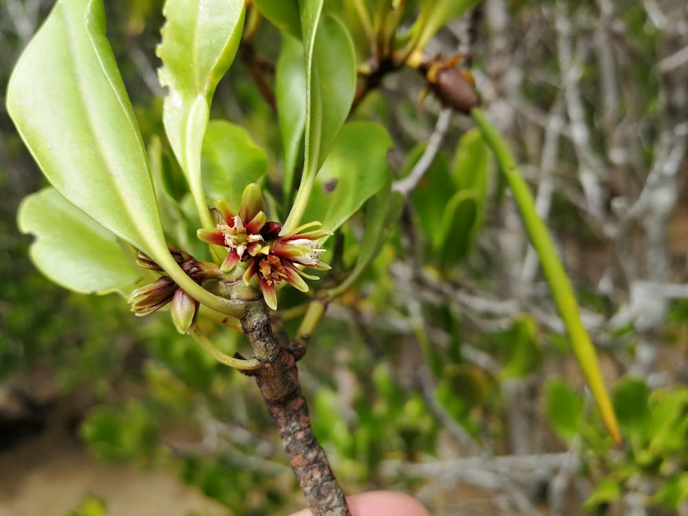
Our research used satellite images to study the life cycles of mangrove forests in the Northern Territory, Queensland, and New South Wales. We compared the satellite images with field data collected in the 1980s, 1990s and 2000s, and found a surprising degree of variation in mangrove life cycles.
We’re using the phrase life cycle, but the scientific term is “phenology”. Phenology is the study of periodic events in the life cycles of plants and animals. For example, some plants flower and fruit during the spring and summer, and some lose their leaves in autumn and winter.
Phenology is important because when plants are growing, they absorb carbon from the atmosphere and store it in their leaves, trunks, roots, and in the soil. As phenology is often affected by environmental conditions, studying phenology helps us understand how climate change is affecting Australian ecosystems such as mangrove forests.
So how can we learn a lot in a short amount of time about mangrove phenology? That’s where satellite imagery comes in.
How we use satellites to study mangrove phenology
Satellites are an excellent tool to study changes in forest health, area, and phenology. Some satellites have been taking images of Earth for decades, giving us the chance to look back at the state of mangrove forests from 30 years ago or more.
You can think of satellite images much like the photo gallery in your smartphone: you can see many of your family members in a single image, and you can see how everyone grows and “blooms” over time. In the case of mangroves, we can see different regions and species in a single satellite image, and we can use past images to study the life cycles of mangrove forests.
For example, satellite images depicted below, which use data from the Australian government’s National Maps website, show how mangroves forests have changed in the Kimberley region of Western Australia between 1990 and 2019. You can see how the mangrove forest has reduced in some areas, but expanded in others. Overall, this mangrove forest seems to be doing pretty well thanks in large part to the fact this area has a reasonably small human population.
@media only screen and (max-width: 450px) {
iframe.juxtapose { height: 220px; width: 100%; }
}
@media only screen and (min-width: 451px) and (max-width: 1460px) {
iframe.juxtapose { height: 360px; width: 100%; }
}
Our study of satellite images of mangrove forests in the Northern Territory, Queensland, and New South Wales – and how they compared with data collected on the ground – found not all mangroves have the same life cycles.
For instance, many mangrove species grow new leaves only once per year, while other species grow new leaves twice a year. These subtle, but important differences will allow us to track the impacts of climate change on mangroves and other forests.
Nicolas Younes
How climate change affects mangrove phenology
Climate change is changing the phenology of many forests, causing them to flower and fruit earlier than expected.
Science cannot yet tell us exactly how mangrove phenology will be affected by climate change but the results could be catastrophic. If mangroves flower or fruit earlier than expected, pollinators such as bats, bees and birds may starve or move to a different forests. Without pollinators, mangroves may not reproduce and can die.
The next step in our research is to figure out how climate change is affecting the life cycles of mangroves. To do this, we will use satellite images of mangroves across Australia and factor in data on temperature and rainfall.
We think rising temperatures are causing longer periods of leaf growth, a theory we plan to test by studying data from now with satellite images from the 80s and 90s.
Shutterstock
Satellite monitoring can’t do it all
Satellites can tell us a lot about how a mangrove forest is faring. For example, satellite images captured a dieback event (depicted below, using data from the Australian government’s National Maps website) that happened between 2015 and 2016, when around 7,400 hectares of mangroves died in the Gulf of Carpentaria due to drought and unusually high air and sea temperatures.
@media only screen and (max-width: 450px) {
iframe.juxtapose2 { height: 280px; width: 100%; }
}
@media only screen and (min-width: 451px) and (max-width: 1460px) {
iframe.juxtapose2 { height: 450px; width: 100%; }
}
But satellite monitoring is not enough on its own and cannot capture the detail you can get on the ground. For example, satellites cannot capture the flowering or fruiting of mangroves because flowers are often too small and fruits are often camouflaged. Also, satellites cannot capture what happens under the canopy.
It is also important to recognise the work of researchers on the ground. Ground data allows us to validate or confirm the information we see in satellite images. When we noted some mangrove forests were growing leaves twice per year, we validated this observation with field data, and confirmed with experts in mangrove ecosystems. Field data is crucial to understand the life cycles of ecosystems worldwide and how forests are responding to changes in the climate.![]()
Shutterstock
Nicolás Younes Cárdenas, Postdoctoral research fellow, James Cook University; Karen Joyce, Senior Lecturer – Remote sensing and spatial information, James Cook University, and Stefan W Maier, Adjunct Research Fellow, James Cook University
This article is republished from The Conversation under a Creative Commons license. Read the original article.
Renewables need land – and lots of it. That poses tricky questions for regional Australia

Shutterstock
Bonnie McBain, University of Newcastle
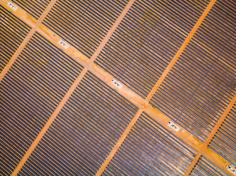
Renewable energy capacity in Australia is expected to double, or even triple, over the next 20 years. There is one oft-overlooked question in this transition: where will it all be built?
Many renewable energy technologies need extensive land area. Wind turbines, for instance, cannot be located too close together, or they won’t work efficiently.
Some land will be in urban areas. But in the transition to 100% renewable energy, land in the regions will also be needed. This presents big challenges, and opportunities, for the farming sector.
Two important factors lie at the heart of a smooth transition. First, we must recognise that building renewable energy infrastructure in rural landscapes is a complex social undertaking. And second, we must plan to ensure renewables are built where they’ll perform best.
Shutterstock
Bringing renewables to the regions
My research has examined how much land future energy generation will require, and the best way to locate a 100% renewable electricity sector in Australia.
A National Farmers Federation paper released last week called for a greater policy focus on renewable energy in regional Australia. It said so-called renewable energy zones should “be at the centre of any regionalisation agenda” and that this would give the technology a competitive advantage.
Hosting renewable energy infrastructure gives farmers a second income stream. This can diversify a farming business and help it withstand periods of financial pressure such as drought. An influx of new infrastructure also boosts regional economies.
But successfully integrating renewables into the agricultural landscape is not without challenges.
A wicked problem
Renewable energy enjoys widespread public support. However its development can lead to social conflicts. For example, opposition to wind wind farms, often concentrated at the local level, can be motivated by concerns about:
- perceived health impacts
- changes to the landscape
- damage to wildlife
- loss of amenity
- reduced property values
- procedural fairness.
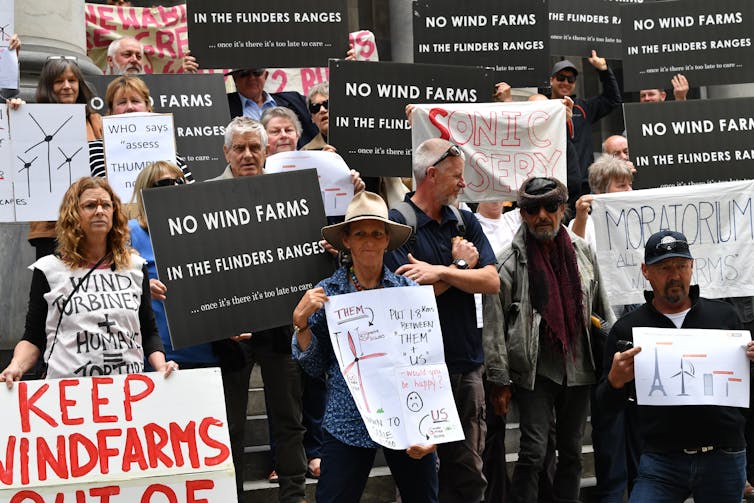
A proposed A$2 billion wind energy development on Tasmania’s King Island shows the difficulties involved in winning community support. The project was eventually scrapped in 2014, for economic reasons.
Research showed how despite the proponents TasWind using a “best practice” mode of community engagement, the proposal caused much social conflict. For example, the holding of a vote served to further polarise the community, and locals were concerned that the community consultation process was not impartial.
Read more:
Against the odds, South Australia is a renewable energy powerhouse. How on Earth did they do it?
The local context was also significant: the recent closure of an abattoir, and associated job losses, had increased the community’s stress and sense of vulnerability. This led some to frame the new proposal as an attempt by a large corporation to capitalise on the island’s misfortune.
The King Island experience has all the hallmarks of a “wicked problem” – one that is highly complex and hard to resolve. Such problems are common in policy areas such as land-use planning and environmental protection.
Daniel Mariuz/AAP
Wicked problems typically involve competing perspectives and interests. Often, there is no single, correct solution that works for everyone. For example at King Island, the abattoir closure did not mean all locals considered the wind energy proposal to be the answer.
When seeking to address complex policy problems, such as building renewable energy in regional areas, the best approach involves:
- collaboration between all affected parties, including people beyond the property where the infrastructure will be located
- relationship-building between all those involved, to allow each to see the other’s perspective
- shared decision-making on whether the infrastructure will be built, and where.
Competition for land is intensifying around the world, especially as the population grows. High consumption levels in the West require ever-more land for resources such as food, and land degradation is rife.
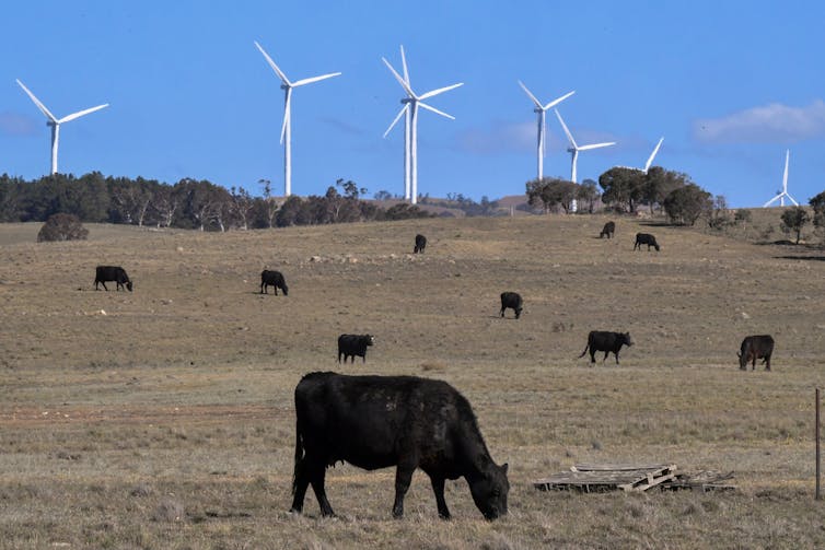
To help alleviate this pressure, renewable energy developments may need to co-exist with other land uses, such as cattle grazing around wind turbines. And in many cases, renewable energy should not be built on the most productive cropping land.
Mick Tsikas/AAP
Recipe for success
A successful energy transition will require strategic, long-term planning to determine where renewable generation is best located.
Our research indicates that while many places in Australia have renewable energy potential, some are far better than others. Wind energy is usually best located near the coast, solar farms in arid inland regions and rooftop solar power in densely-populated eastern Australia.
Read more:
Explainer: what is the electricity transmission system, and why does it need fixing?
Traditionally, Australia’s electricity grid infrastructure, such as high-voltage transmission lines, has been located around coal-fired generators and large population centres. Locating renewables near this infrastructure might make it cheaper to connect to the grid. But those sites may not be particularly windy or sunny.
Australia’s electricity grid should be upgraded and expanded to ensure renewables generators are located where they can perform best. Such strategic planning is just what the National Farmers Federation is asking for. Improved connectivity will also help make electricity supplies more reliable, allowing electricity to be transferred between regions if needed.
Making renewables do-able
The economic and environmental benefits of renewable energy are well known. But without social acceptance by communities hosting the infrastructure, the clean energy transition will be slowed. There is more work to be done to ensure new renewables projects better respond to the needs of regional communities.
And to ensure Australia best fulfils its renewable energy potential, electricity grid technology must be upgraded and expanded. To date, such planning has not featured prominently enough in public conversation and government policy.
If Australia can overcome these two tricky problems, it will be well on the way to ensuring more reliable electricity, the best return on investment and a low-carbon energy sector.
Read more:
People need to see the benefits from local renewable energy projects, and that means jobs
![]()
Bonnie McBain, Lecturer, University of Newcastle
This article is republished from The Conversation under a Creative Commons license. Read the original article.
The dingo fence from space: satellite images show how these top predators alter the desert
Mike Letnic
Adrian G. Fisher, UNSW; Charlotte Mills, UNSW; Mike Letnic, UNSW; Mitchell Lyons, and Will Cornwell, UNSW
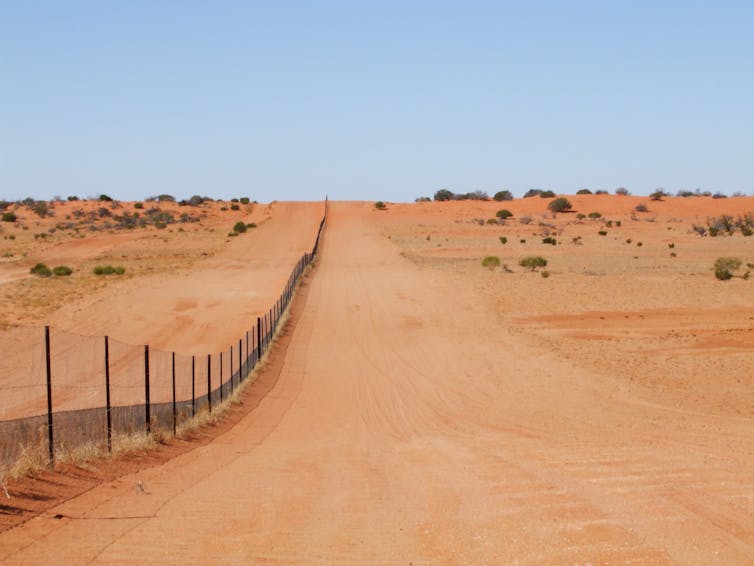
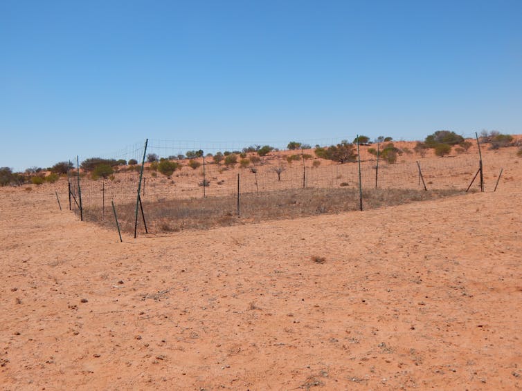
As one of the longest structures in the world, the dingo fence is an icon of Australia. It stretches more than 5,600 kilometres across three states, including 150 kilometres that traverses the red sand dunes of the Strzelecki Desert.
Since it was established in the early 20th century, the fence has had one job: to keep dingoes out. The effect of this on the environment has been enormous — in fact, you can see it from outer space.
Our research has, for the first time, used satellite imagery to show the effects of predators on vegetation at a vast scale.
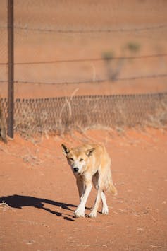
Dingoes eat kangaroos, and kangaroos eat grass. So on the side of the fence where dingoes are rare, there are more kangaroos, and less grass cover between sand dunes. This has important flow-on effects for the ecosystem in the region.
Similar changes to vegetation may have occurred throughout the world, where other large predators, such as wolves or big cats, have been removed. But these aren’t visible without the stark contrast boundaries like the dingo fence provide.
Reshaping the landscape
The fence was built to stop dingoes moving into sheep grazing land in southeastern Australia. As Australia’s largest terrestrial predator, dingoes pose a big threat to livestock.
Today, dingoes “inside” the fence continue to be killed by various means (not all of them humane), including poison baits, trapping and shooting.
Nick Chu
It has long been understood that removing large predators can drive changes in ecosystems across large areas. A well-known example is the removal of wolves in Yellowstone National Park in the 1920s, which saw an elk grazing increase, limiting the growth of tree and shrub seedlings.
Where dingoes are removed, increasing populations of kangaroos can lead to overgrazing. This, in turn, damages the quality of the soil, making the landscape more vulnerable to erosion.
Less vegetation can also leave small animals, such as the vulnerable dusky hopping mouse, exposed to other threats like cat predation. Indeed, 2019 research showed dingoes “outside” the fence keep cat and fox populations down in the Strzelecki Desert.
Read more:
Like cats and dogs: dingoes can keep feral cats in check
And research from 2018 showed dingo removal could even reshape the desert landscape, as changes to vegetation alter wind flow and sand movement.
Changes this large can’t be seen from the ground
Often, however, the effects of removing predators have gone unnoticed. There are two main reasons why.
First, many large predators were removed before scientists monitored ecosystems. For example, wolves were hunted to extinction in Britain during the 17th or 18th century (although there are now proposals to reintroduce them).
Second, changes occur over such large areas, so it’s difficult to spot any differences when researching from the ground.
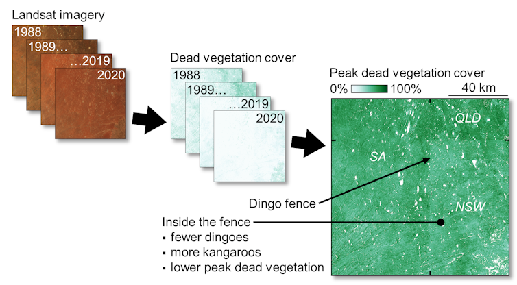
So to gauge the impact of the fence, we used images captured by sensors on the NASA Landsat satellites, which have been regularly observing the Earth since 1972.
We looked at a section of the fence that follows the state border of New South Wales through the Strzelecki Desert, and used this to analyse the effects of removing a top predator.
Capturing the impact
We used images processed for Australia by the Joint Remote Sensing Research Program, which are publicly available.
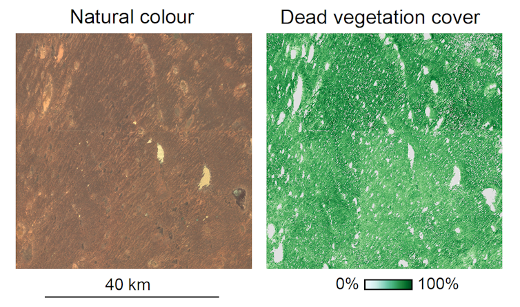
Using thousands of field measurements, each satellite image was converted into an image of “fractional cover”. This splits the landscape into three core components: bare soil, green vegetation and dead or dry vegetation.
Read more:
Kangaroos (and other herbivores) are eating away at national parks across Australia
The dead vegetation fraction, which includes all non-photosynthetic material such as dry leaves and twigs, is particularly useful in the desert. It’s a more reliable indicator of vegetation cover, as green vegetation only sticks around for three months or so after rain.
Viewing “natural colour” satellite images of the Strzelecki Desert, as our eyes see the world, doesn’t show the differences across the dingo fence very well. But when we view images of dead vegetation cover a few months after rainfall, we can see the stark effect kangaroo grazing has on the landscape, where dingoes are rare.
You can see these effects in the images below.
Adrian Fisher
When we analysed dead vegetation cover images for each season between 1988 and 2020, we found obvious differences between the maximum dead vegetation cover and the variability of dead vegetation cover through time, as the images below show.
Adrian Fisher
The results from satellite images were supported by ground surveys. This included repeated nighttime counts of kangaroos and dingoes seen with powerful spotlights.
We also fenced off plots and observed how the vegetation changed. After five years, the kangaroo-free plots in the dingo-free areas looked like islands of grass in an otherwise bare desert.
Mike Letnic
What do we do about dingoes?
So, should we tear down the fence to reintroduce dingoes back into landscapes for the biodiversity benefits, like wolves in Yellowstone?
There are no simple answers to this question. Allowing dingoes to return to the landscape inside the fence will reduce kangaroo numbers and increase grass growth — but will also devastate sheep farming.
Conservationists, farmers and other land managers need to start discussing where and how we can safely return dingoes to landscapes, finding a balance between restoring ecosystems and protecting farms.
Read more:
Living blanket, water diviner, wild pet: a cultural history of the dingo
![]()
Adrian G. Fisher, Lecturer in Remote Sensing, UNSW; Charlotte Mills, Visiting Fellow, UNSW; Mike Letnic, Professor, Evolution and Ecology Research Centre, UNSW; Mitchell Lyons, Postdoctoral research fellow, UNSW, and Will Cornwell, Associate Professor in Ecology and Evolution, UNSW
This article is republished from The Conversation under a Creative Commons license. Read the original article.
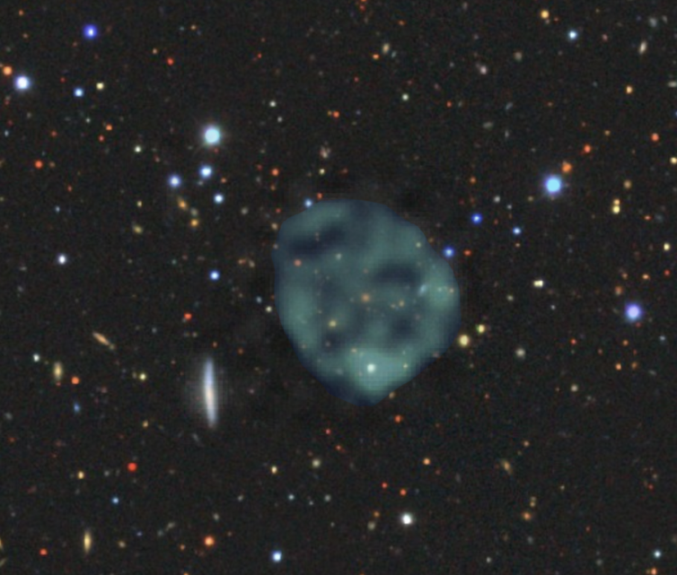
‘WTF?’: newly discovered ghostly circles in the sky can’t be explained by current theories, and astronomers are excited
Bärbel Koribalski / ASKAP, Author provided
Ray Norris, Western Sydney University
In September 2019, my colleague Anna Kapinska gave a presentation showing interesting objects she’d found while browsing our new radio astronomical data. She had started noticing very weird shapes she couldn’t fit easily to any known type of object.
Among them, labelled by Anna as WTF?, was a picture of a ghostly circle of radio emission, hanging out in space like a cosmic smoke-ring. None of us had ever seen anything like it before, and we had no idea what it was. A few days later, our colleague Emil Lenc found a second one, even more spooky than Anna’s.
Image by Bärbel Koribalski, based on ASKAP data, with the optical image from the [Dark Energy Survey](https://www.darkenergysurvey.org), Author provided
Anna and Emil had been examining the new images from our pilot observations for the Evolutionary Map of the Universe (EMU) project, made with CSIRO’s revolutionary new Australian Square Kilometre Array Pathfinder (ASKAP) telescope.
EMU plans to boldly probe parts of the Universe where no telescope has gone before. It can do so because ASKAP can survey large swathes of the sky very quickly, probing to a depth previously only reached in tiny areas of sky, and being especially sensitive to faint, diffuse objects like these.
I predicted a couple of years ago this exploration of the unknown would probably make unexpected discoveries, which I called WTFs. But none of us expected to discover something so unexpected, so quickly. Because of the enormous data volumes, I expected the discoveries would be made using machine learning. But these discoveries were made with good old-fashioned eyeballing.
Read more:
Expect the unexpected from the big-data boom in radio astronomy
Hunting ORCs
Our team searched the rest of the data by eye, and we found a few more of the mysterious round blobs. We dubbed them ORCs, which stands for “odd radio circles”. But the big question, of course, is: “what are they?”
At first we suspected an imaging artefact, perhaps generated by a software error. But we soon confirmed they are real, using other radio telescopes. We still have no idea how big or far away they are. They could be objects in our galaxy, perhaps a few light-years across, or they could be far away in the Universe and maybe millions of light years across.
When we look in images taken with optical telescopes at the position of ORCs, we see nothing. The rings of radio emission are probably caused by clouds of electrons, but why don’t we see anything in visible wavelengths of light? We don’t know, but finding a puzzle like this is the dream of every astronomer.
Read more:
The Australian Square Kilometre Array Pathfinder finally hits the big-data highway
We know what they’re not
We have ruled out several possibilities for what ORCs might be.
Could they be supernova remnants, the clouds of debris left behind when a star in our galaxy explodes? No. They are far from most of the stars in the Milky Way and there are too many of them.
Could they be the rings of radio emission sometimes seen in galaxies undergoing intense bursts of star formation? Again, no. We don’t see any underlying galaxy that would be hosting the star formation.
Could they be the giant lobes of radio emission we see in radio galaxies, caused by jets of electrons squirting out from the environs of a supermassive black hole? Not likely, because the ORCs are very distinctly circular, unlike the tangled clouds we see in radio galaxies.
Could they be Einstein rings, in which radio waves from a distant galaxy are being bent into a circle by the gravitational field of a cluster of galaxies? Still no. ORCs are too symmetrical, and we don’t see a cluster at their centre.
A genuine mystery
In our paper about ORCs, which is forthcoming in the Publications of the Astronomical Society of Australia, we run through all the possibilities and conclude these enigmatic blobs don’t look like anything we already know about.
So we need to explore things that might exist but haven’t yet been observed, such as a vast shockwave from some explosion in a distant galaxy. Such explosions may have something to do with fast radio bursts, or the neutron star and black hole collisions that generate gravitational waves.
Read more:
How we closed in on the location of a fast radio burst in a galaxy far, far away
Or perhaps they are something else entirely. Two Russian scientists have even suggested ORCs might be the “throats” of wormholes in spacetime.
From the handful we’ve found so far, we estimate there are about 1,000 ORCs in the sky. My colleague Bärbel Koribalski notes the search is now on, with telescopes around the world, to find more ORCs and understand their cause.
It’s a tricky job, because ORCS are very faint and difficult to find. Our team is brainstorming all these ideas and more, hoping for the eureka moment when one of us, or perhaps someone else, suddenly has the flash of inspiration that solves the puzzle.
It’s an exciting time for us. Most astronomical research is aimed at refining our knowledge of the Universe, or testing theories. Very rarely do we get the challenge of stumbling across a new type of object which nobody has seen before, and trying to figure out what it is.
Is it a completely new phenomenon, or something we already know about but viewed in a weird way? And if it really is completely new, how does that change our understanding of the Universe? Watch this space!![]()
Ray Norris, Professor, School of Science, Western Sydney University
This article is republished from The Conversation under a Creative Commons license. Read the original article.
‘It is quite startling’: 4 photos from space that show Australia before and after the recent rain
National Map
Sunanda Creagh, The Conversation
Editor’s note: These before-and-after-images from several sources –NASA’s Worldview application, National Map by Geoscience Australia and Digital Earth Australia – show how the Australian landscape has responded to huge rainfall on the east coast over the last month. We asked academic experts to reflect on the story they tell:
Warragamba Dam, Sydney
Stuart Khan, water systems researcher and professor of civil and environmental engineering.
This map from Digital Earth Australia shows a significant increase in water stored in Lake Burragorang. Lake Burragorang is the name of water body maintained behind the Warragamba Dam wall and the images show mainly the southern source to the lake, which is the Wollondilly River. A short section of the Coxs River source is also visible at the top of the images.
The Warragamba catchment received around 240mm of rain during the second week of February, which produced around 1,000 gigalitres (GL) of runoff to the lake. This took the water storage in the lake from 42% of capacity to more than 80%.
Unlike a typical swimming pool, the lake does not generally have vertical walls. Instead, the river valley runs deeper in the centre and more shallow around the edges. As water storage volumes increase, so does the surface area of water, which is the key feature visible in the images.
Leading up to this intense rainfall event, many smaller events occurred, but failed to produce any significant runoff. The catchment was just too dry. Dry soils act like a sponge and soak up rainfall, rather than allowing it to run off to produce flows in waterways.
The catchment is now in a much wetter state and we can expect to see smaller rainfall events effectively produce further runoff. So water storage levels should be maintained, at least in the short term.
However in the longer term, extended periods of low rainfall and warm temperatures will make this catchment drier.
In the absence of further very intense rainfall events, Sydney will lapse back into drought and diminishing water storages.
This pattern of decreasing storage, broken only by very intense rainfall, can be observed in Sydney’s water storage history.
It is a pattern likely to be exacerbated further in future.
Wivenhoe Dam, Brisbane
@media only screen and (max-width: 450px) {
iframe.juxtapose { height: 320px; width: 100%; }
}
@media only screen and (min-width: 451px) and (max-width: 1460px) {
iframe.juxtapose { height: 400px; width: 100%; }
}
Stuart Khan, water systems researcher and professor of civil and environmental engineering.
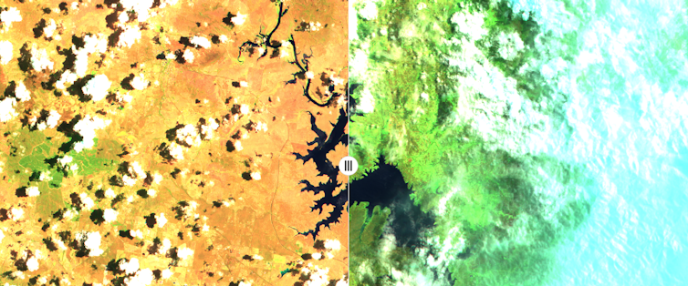
Lake Wivenhoe is the body of water maintained behind Wivenhoe Dam wall in southeast Queensland. It is the main water storage for Brisbane as well as much of surrounding southeast Queensland.
This image from National Map shows a visible change in colour from brown to green in the region around the lake. It is quite startling.
This is especially the case to the west of the lake, in mountain range areas such as Toowoomba, Warwick and Stanthorpe. Many of these areas were in very severe drought in January. Stanthorpe officially ran out of water. The February rain has begun to fill many important water storage areas and completely transformed the landscape.
Unfortunately, this part of Australia is highly prone to drought and we can expect to see this pattern recur over coming decades.
Much climate science research indicates more extreme weather events in future. That means more extreme high temperatures, more intense droughts and more severe wet weather.
There are many challenges ahead for Australian water managers as they seek to overcome the inevitable booms and busts of future water availability.
Read more:
Bushfires threaten drinking water safety. The consequences could last for decades
Australia-wide
@media only screen and (max-width: 450px) {
iframe.juxtapose { height: 320px; width: 100%; }
}
@media only screen and (min-width: 451px) and (max-width: 1460px) {
iframe.juxtapose { height: 400px; width: 100%; }
}
Grant Williamson, Research Fellow in Environmental Science, University of Tasmania
It’s clear from this map above, from NASA Worldview, the monsoon has finally arrived in northern Australia and there’s been quite a lot of rain.
On the whole, you can see how rapidly the Australian environment can respond to significant rainfall events.
It’s important to remember that most of that greening up will be the growth of grasses, which respond more rapidly after rain.
The forests that burned will not be responding that quickly. The recovery process will be ongoing and within six months to a year you’d expect to see significant regrowth in the eucalyptus forests.
Other more fire-sensitive vegetation, like rainforests, may not exhibit the same sort of recovery.
Grant Williamson, Research Fellow in Environmental Science, University of Tasmania
This slider from National Map shows both fire impact, and greening up after rain.
On the left – an area west of Cooma on December 24 – you can see the yellow treeless areas, indicating the extent of the drought, and the dark green forest vegetation. This image also shows quite a lot of smoke, as you’d expect.
On the right – the area on February 22 – a lot of those yellow areas are now significantly greener after the rain. However, some of those dark green forest areas are now brown or red, where they have been burnt.
It’s clear there is a long road ahead for recovery of these forests that were so badly burned in the recent fires but they will start resprouting in the coming months.
Grant Williamson is a Tasmania-based researcher with the NSW Bushfire Risk Management Research Hub.![]()
Sunanda Creagh, Head of Digital Storytelling, The Conversation
This article is republished from The Conversation under a Creative Commons license. Read the original article.
Curious Kids: is the sky blue on other planets?

NASA/JPL-Caltech/SwRI/MSSS/Gerald Eichstädt, CC BY-SA
Jake Clark, University of Southern Queensland
Is the sky blue on other planets, like on Earth? What is an atmosphere, and do other planets have one? – Charlie, age 10

G’day Charlie, and thank you so much for your incredibly curious question.
Before I get too excited talking about the atmospheres of other planets, first we have to talk about what an atmosphere actually is.
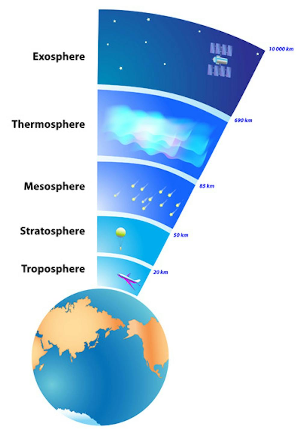
ESA
The atmosphere is normally the outermost layer of a planet. On rocky worlds like Earth it is usually the lightest and thinnest layer.
The thing that makes an atmosphere an atmosphere is what it’s made of. It’s not made up of big lumps of rocks or huge swirling oceans; it is made up of gases.
What’s in an atmosphere?
Atmospheres can contain a wide variety of gases. Most of Earth’s atmosphere is a gas called nitrogen that doesn’t really react with anything. There’s also a fair bit of oxygen, which is what we need to breathe. There are also two other important gases called argon and carbon dioxide, and tiny amounts of lots of other ones.
The mix of gases is what gives a planet’s atmosphere its colour.
Read more:
Curious Kids: Why is the sky blue and where does it start?
Earth’s atmosphere is made up of gases that tend to bounce blue light in all directions (known as “scattering”) but let most other colours of light straight through. This scattered light is what gives Earth’s atmosphere its blue colour.
Do other planets have blue atmospheres? Some of them sure do!
Other worlds
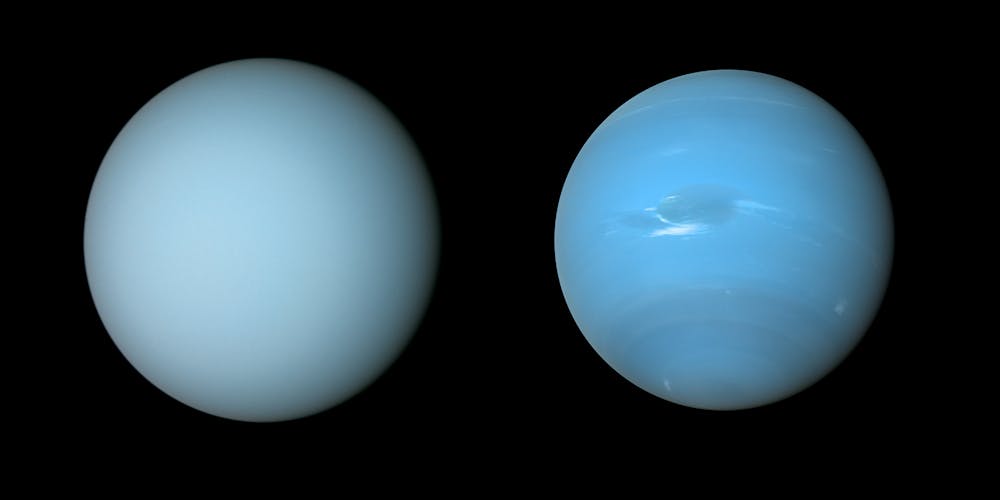
The atmospheres of the two ice giants in our solar system, Neptune and Uranus, are both beautiful shades of blue.
However, these atmospheres are a different blue than ours. It’s caused by the huge amounts of a gas called methane swirling around.
(Side note: methane is also the main component of farts. That’s right, there’s a layer of farts on Uranus.)
NASA / JPL-Caltech / Björn Jónsson
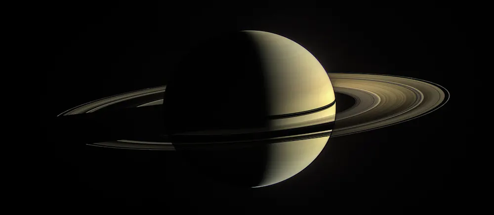
Jupiter and Saturn, however, have completely different-coloured atmospheres.
Ice crystals made of a chemical called ammonia in Saturn’s upper atmosphere make it a pale shade of yellow.
Uranus’ atmosphere also contains some ammonia, which makes the planet a slightly greener shade than the deep blue we see on Neptune.
Jupiter’s atmosphere has distinctive brown and orange bands, thanks to gases that may contain the elements phosphorus and sulfur, and possibly even more complicated chemicals called hydrocarbons.**
In some extreme cases, the entire planet might just be a huge atmosphere with no rocky surface at all. Astronomers and planetary scientists like myself are still trying to work out whether Jupiter and Saturn have rocky surfaces, deep down in their atmosphere, or whether they’re both simply huge balls of gas.
NASA/JPL-Caltech/Space Science Institute
However, there are some planets that have no atmosphere at all! The Sun’s closest and smallest neighbour, Mercury, is one example. Its surface is exposed to the vastness of space.
Beyond our solar system
So far I’ve been talking about the atmospheres of planets in our Solar system. But what about planets in other planetary systems, orbiting other stars?
Well, astronomers have been detecting the atmospheres of these planets (which we call “exoplanets”) for the past 20 years! It wasn’t until last year, however, that astronomers managed to detect the atmosphere of a rocky exoplanet. The planet is called LHS 3844b and it’s so far away that the light takes almost 50 years to reach us!
LHS 3844b weighs twice as much as Earth, and we astronomers thought it would have a pretty thick atmosphere. But, to our surprise, it has little to no atmosphere at all! So it might be more like Mercury than Earth.
We still have a lot to learn about far-off planets and discovering one with an Earth-like atmosphere that’s ripe for life is still many years away.
Maybe, Charlie, you could be the first astronomer to detect an Earth-like atmosphere on another world!![]()
Jake Clark, PhD Candidate, University of Southern Queensland
This article is republished from The Conversation under a Creative Commons license. Read the original article.
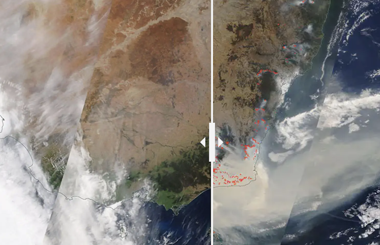
‘This crisis has been unfolding for years’: 4 photos of Australia from space, before and after the bushfires
NASA
Molly Glassey, The Conversation; Sunanda Creagh, The Conversation, and Wes Mountain, The Conversation
Editor’s note: We pulled four before-and-after-images from NASA’s Worldview application, and asked bushfire researcher Grant Williamson to reflect on the story they tell. Here’s what he told us:
I’ve been studying fires for more than a decade. I use satellite data to try to understand the global and regional patterns in fire – what drives it and how it will shift in the future as our climate and land use patterns change.
When I look at these images I think: this is a crisis we have seen coming for years. It’s something I have been watching unfold.
Look at the sheer scale of it. Seeing this much fire in the landscape in such a broad area, seeing so much severe fire at once, this quantity and concentration of smoke – it is astonishing. I haven’t seen it like this before.
November 1, 2019 and January 3, 2020
@media only screen and (max-width: 450px) {
iframe.juxtapose { height: 400px; width: 100%; }
}
@media only screen and (min-width: 451px) and (max-width: 1460px) {
iframe.juxtapose { height: 590px; width: 100%; }
}
In this comparison, you can see November last year versus now. In the present picture (on the right hand side) you can see a vast quantity of intense fires currently burning right down the eastern seaboard and a huge amount of smoke. It’s been blowing out across toward New Zealand for weeks now.
The scale of the current fires is definitely unusual. In a typical year, you might see, for example, a large fire in the alps (near Mount Kosciuszko) or in the Blue Mountains – but they would be isolated events.
What’s striking here is that there is so much going on at once. I have never seen it like this before.
Black Saturday smoke, Feburary 8, 2009 and the 2019-2020 bushfires smoke, January 3, 2020
This one is comparing two smoke events: one from Black Saturday and one from the current fires. In both cases, huge quantities of smoke was released. Both times, the sort of forest burning is very dense, there is a lot of wet eucalypt forest here which naturally has a high fuel load and that’s creating all that smoke. This type of forest only burns during extreme weather conditions.
Simply due to the scale of it and the fact that it’s been going on so long, I would say the current event is worse than Black Saturday, in terms of the quantity of smoke.
East Australia, 10 years ago vs today
In this image, we can the impact of drought. A decade ago, on the left hand side, it was clearly quite green along eastern Australia. That green shows there is a lot of growing vegetation there: pasture crops, grasses and a very wet environment.
If you compare that to the current year, on the right hand side, you can see it’s now extremely brown and extremely dry. There’s not much in the way of vegetation. That’s a result of drought and high temperatures.
Kangaroo Island, 2 months ago vs today
In this image, you can see Kangaroo Island two months ago on the left hand side, versus today.
The main thing I note here is the drying. The “before” image is so much greener than the “after” image. So there’s a real lack of rainfall that’s driving fire severity in this area. You can really see how much the island has dried out.
This has been an extraordinary year for climate and weather, and that’s manifesting now in these unprecedented bushfires. It’s not over yet.
But what’s important is the lessons we draw from this crisis and doing as much as we can to reduce the risk in future.
Grant Williamson is a Tasmania-based researcher with the NSW Bushfire Risk Management Research Hub.![]()
Molly Glassey, Digital Editor, The Conversation; Sunanda Creagh, Head of Digital Storytelling, The Conversation, and Wes Mountain, Multimedia Editor, The Conversation
This article is republished from The Conversation under a Creative Commons license. Read the original article.
Look up! Your guide to some of the best meteor showers for 2020
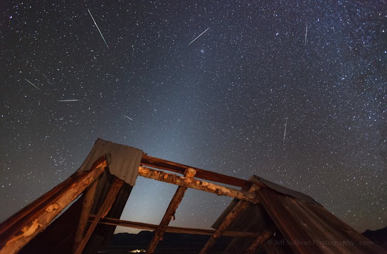
Flickr/Jeff Sullivan, CC BY-NC-ND
Jonti Horner, University of Southern Queensland and Tanya Hill, Museums Victoria
Where 2019 was a disappointing year for meteor showers, with two of the big three (the Quadrantids, Perseids and Geminids) lost mainly to moonlight, 2020 promises to be much better.
The year starts with a bang with the Quadrantids providing a treat for northern hemisphere viewers. The Perseids, in August, provide another highlight for those in the northern hemisphere, while the December Geminids round the year off for observers all around the world.
Read more:
Explainer: why meteors light up the night sky
But the big three aren’t the only meteor showers that will put on a show this year. So when should you look up to see the meteoric highlights of the coming year?
Here’s our pick of the showers to watch. We have the time each shower is forecast to peak, finder charts showing you where best to look, and the theoretical peak rates you could see under ideal observing conditions. This is a number known as the Zenithal Hourly Rate (ZHR).
Because the ZHR is the theoretical maximum rate you could see per hour, it is likely that the rates you observe will be lower.
For any meteor shower, if you want to give yourself the best chance to see a good display, it is worth trying to find a good dark site, as far from light polluted skies as possible. Once you’re outside give yourself plenty of time to adapt to the darkness, at least half an hour. Then just sit back, relax, and enjoy the show.
Showers that can only really be seen from either the northern or southern hemisphere are denoted by [N] or [S], whilst those that can be seen from both are marked by [N/S].
You can download a ICS file of this guide to add to your favourite calender.
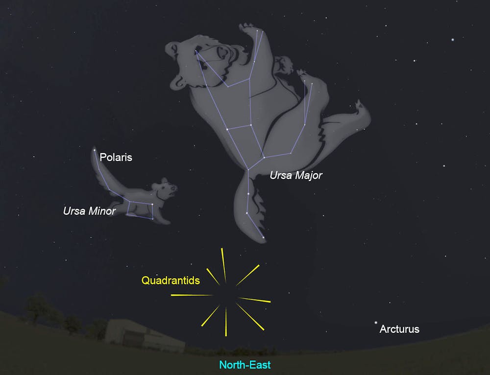
Quadrantids [N]
Active: December 28 – January 12
Maximum: January 4, 8:20am UTC = 8:20am GMT = 3:20am EST = 12:20am PST
ZHR: 120 (variable, can reach ~200)
Parent: It’s complicated… (Comet 96P/Macholz and asteroid 2003 EH1)
The Quadrantids are the first of the big three meteor showers of the year – the three showers that give fabulous displays with ZHRs in excess of 100, year in, year out.
For most of the fortnight over which the Quadrantids are active, rates are low – just a few meteors per hour. In the hours approaching their peak, rates climb rapidly, before falling away just as rapidly once the peak is past. In total, rates exceed a quarter of their maximum value for just eight hours, centred on the peak.
Museums Victoria/stellarium
The Quadrantid radiant is circumpolar (never sets) for locations north of 40 degrees north. As a result, the shower can be observed throughout the hours of darkness for most locations in Europe and many in North America.
The radiant lies in the constellation Boötes, the Herdsman, relatively near the tail of Ursa Major, the Plough or Great Bear.
The radiant rises highest in the sky in the early hours of the morning, so this is when the best rates can be seen. In 2020, the shower’s peak favours observers in the east of North America, though those in northern Europe should see a good display in the hours before dawn on the morning of January 4.
If skies are clear it is definitely worth wrapping up warm and heading out to observe the most elusive of the year’s big three.
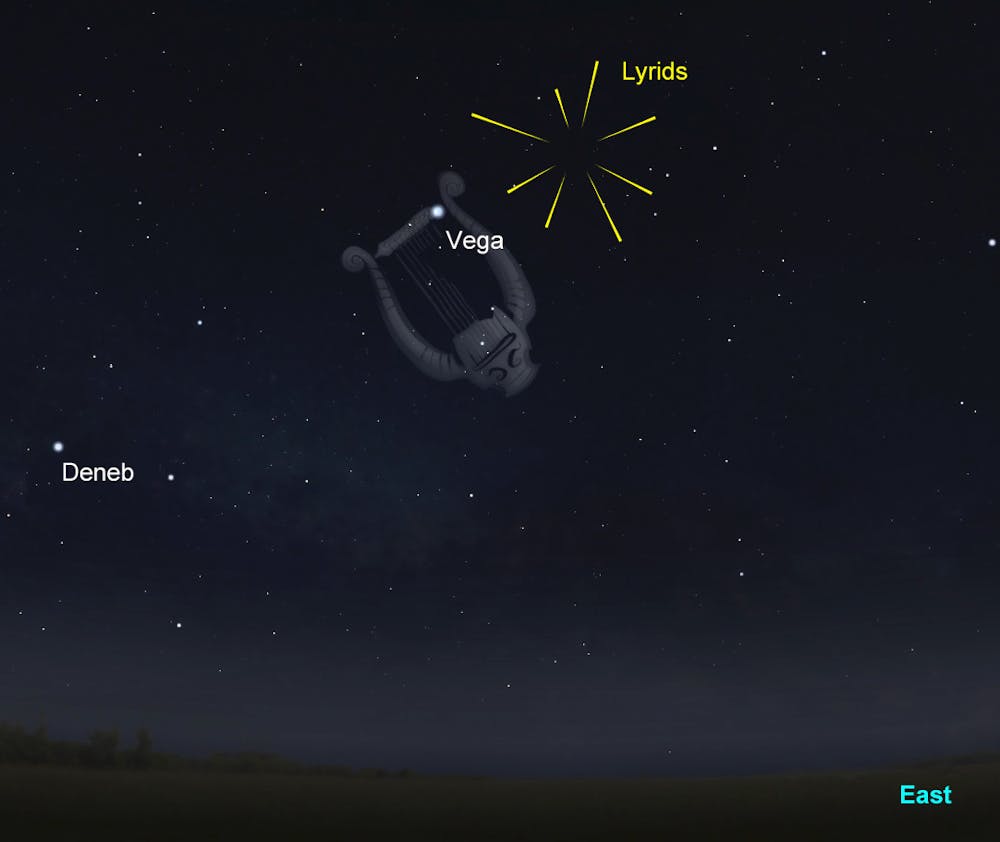
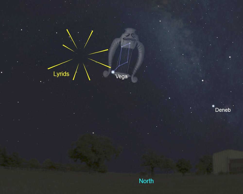
Lyrids [N/S; N preferred]
Active: April 14 – 30
Maximum: Variable – between April 21, 10:40pm UTC and April 22, 9:40am UTC (April 22 9:40am UTC = 4:40am EST = 1:40am PST)
ZHR: 18 (variable, can reach ~90)
Parent: Comet C/1861 G1 Thatcher
The Lyrids are a shower with a long and storied history – with records reporting their activity tracing back for millennia. Researchers have even suggested the Lyrids may have been active on Earth for more than a million years.
In the distant past, there are reports the Lyrids produced some spectacular displays – meteor storms, with thousands of meteors visible per hour.
The modern Lyrids are usually more sedate, with peak rates rarely exceeding ~18 meteors per hour. But they do sometimes throw up the odd surprise. An outburst of the Lyrids in 1982 yielded rates of ~90 meteors per hour for a short period.
While no such outburst is forecast this year, the peak of the shower will occur just a day before a new Moon, so skies will be dark and viewing conditions ideal.
Museums Victoria/Stellarium
Although the Lyrids are best seen from the northern hemisphere, their radiant can reach a useful altitude for observers in the northern half of Australia. Keen observers might be tempted to head out in the early hours of the morning to watch.
Museums Victoria/Stellarium
The radiant rises during the night so the best rates are seen in the early hours of the morning, before dawn. From northern hemisphere sites, reasonable rates can be seen after about 10:30pm, local time -– but for those at southern hemisphere latitudes, the radiant fails to reach a reasonable altitude until well after midnight.
Lyrid meteors tend to be relatively fast and are often bright. Despite the relatively low rates (at least, compared to the big three) they are well worth a watch, especially as conditions this year will be as close to perfect as possible.
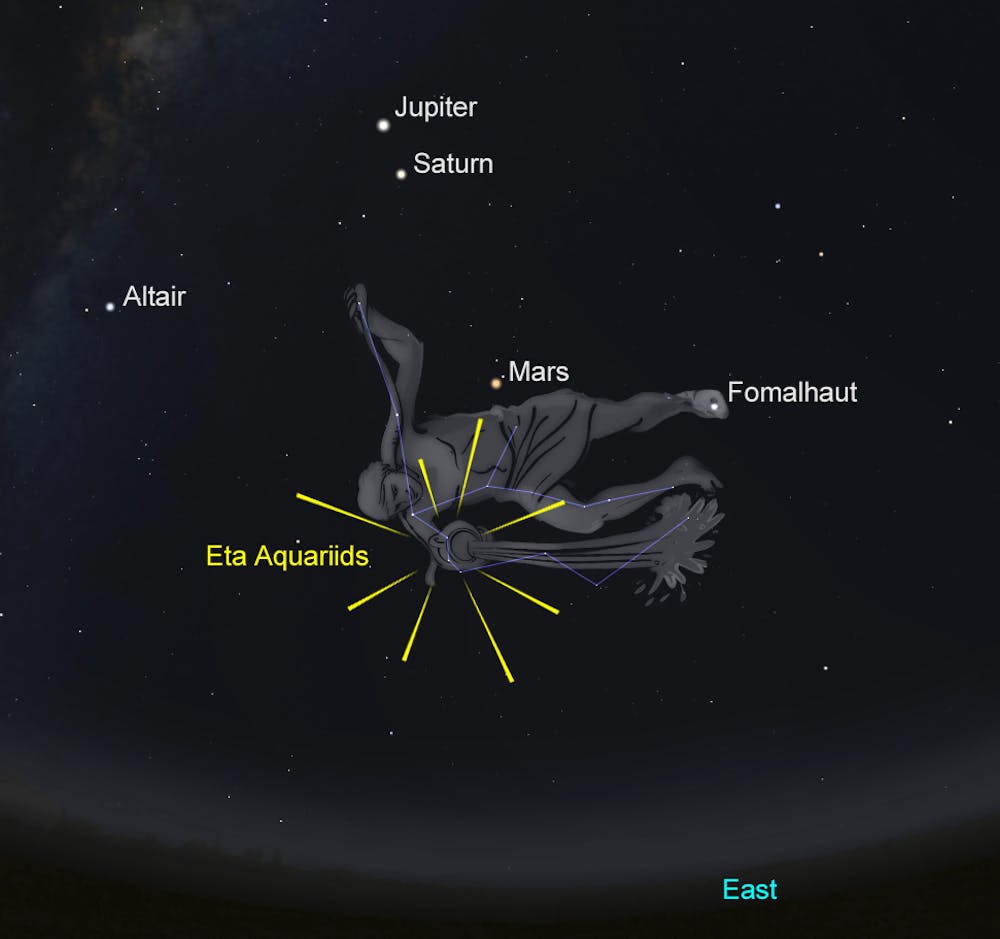
Eta Aquariids [S]
Active: April 19 – May 28
Maximum: May 5, 9pm UTC = May 6, 7am AEST (Qld/NSW/ACT/Vic/Tas) = May 6, 4am AWST (WA) = May 6, 6am JST
ZHR: 50+
Parent: Comet 1P/Halley
While not counted as one of the big three, in many ways the Eta Aquariids stand clear of the pack as the best of the rest.
Only really visible to observers in the tropics and the southern hemisphere, the Eta Aquariids are fragments of the most famous of comets –- Halley’s comet. They mark the first (and best) of two passages made by the Earth through the debris laid down by that comet over thousands of years –- with the other being the Orionids, in October.
Museums Victoria/Stellarium
The radiant only rises a few hours before dawn, even at southern altitudes, and the further north you go, the closer to sunrise the radiant appears. This is what prevents northern hemisphere observers from taking advantage of the Eta Aquariids –- the Sun has risen by the time the radiant is high enough for the shower to put on a decent show.
The meteors are fast and often bright, and the brighter ones have a reputation for leaving behind noticeable smoky trains. The maximum of the shower is broad, with rates remaining above ~30 meteors per hour for the week around the date of the maximum.
It is well worth getting out to observe the Eta Aquariids at around the time their radiant rises. This gives the maximum amount of time to observe the shower before dawn, but in addition, those few meteors you observe when the radiant is sitting just above the horizon can be spectacular.
Known as Earthgrazers, such meteors enter the atmosphere at a very shallow angle, with the result that they can streak all the way across the sky, from horizon to horizon.
The Eta Aquariids reach their peak in 2020 a couple of days before the full Moon. That the radiant does not rise until a few hours before sunrise works to our advantage this year –- the shower’s radiant will rise at around the same time the Moon sets, so the shower can be observed in Moon-free skies, despite the proximity of the Full Moon.
Perseids [N]
Active: July 17 – August 24
Maximum: August 12, 1pm – 4pm UTC = 3am – 6am HST = 10pm – August 13, 1am JST + filament passage ~3 hours before the main peak
ZHR: 110
Parent: Comet 109P/Swift-Tuttle
For northern hemisphere observers, the Perseids are perhaps the famous and reliable shower of the year.
While the Geminids offer higher rates, the Perseids fall during the middle of the northern summer, when families are often holidaying and the weather is warm and pleasant. As a result, the Perseids are the most widely observed of all meteor showers, and never fail to put on a spectacular show.
The parent comet of the Perseid meteor shower, 109P/Swift-Tuttle, was last at perihelion (closest to the Sun) in 1991. As a result, during the 1990s, the Perseids offered enhanced rates –- often displaying multiple peaks through the two or three days around their traditional maximum.
Those individual peaks were the result of the Earth passing through individual trails of material, laid down at past perihelion passages of the comet, which have not yet had time to fully disperse into the background of the shower as a whole.
It is now three decades since the comet’s last perihelion passage, but astronomers predict the Earth could well pass through one of those debris trails this year, at around 10am UTC (midnight Hawaii time, 3am Vancouver time), three hours before the normal forecast maximum for the shower.
As a result, peak rates should last for longer, and potentially reach higher values than would normally be expected from a typical Perseid return.
The radiant rises in the mid-evening from northern latitudes, which means the shower can be observed from around 10pm or 11pm, local time. The later in the night you look, the higher the radiant will be, and so the more meteors will be visible.
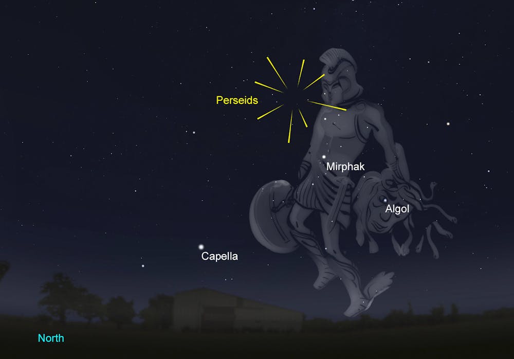
Museums Victoria/Stellarium
Unfortunately, the peak of the Perseids in 2020 falls two days after the last quarter Moon, which means moonlight will begin to interfere with the display in the early hours of the morning. The best views of the shower will likely be seen between ~10pm or 11pm local time and ~2am the following morning.
If you can only observe in the hours before dawn, all is not lost. The Perseids are famed for producing plenty of bright meteors. They are worth observing even when the Moon is above the horizon, particularly on the nights around the forecast peak.
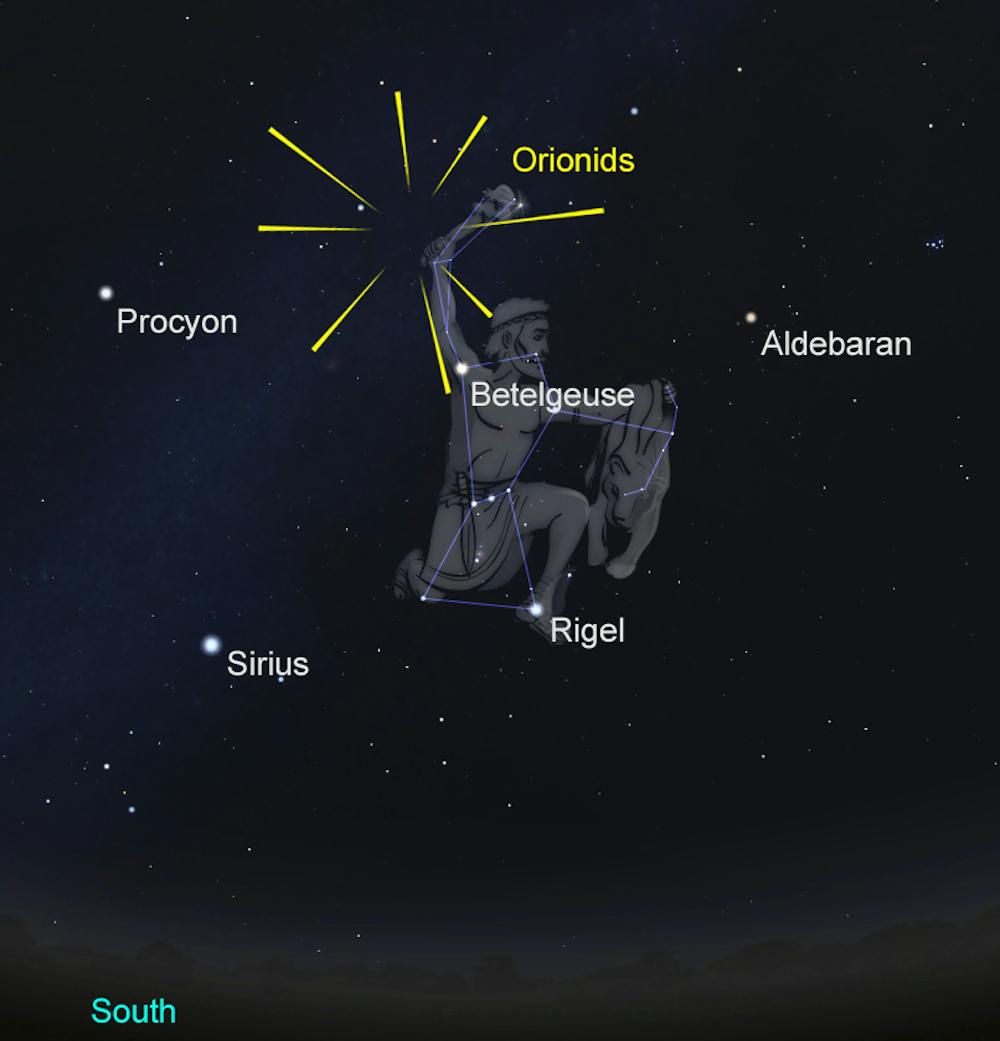
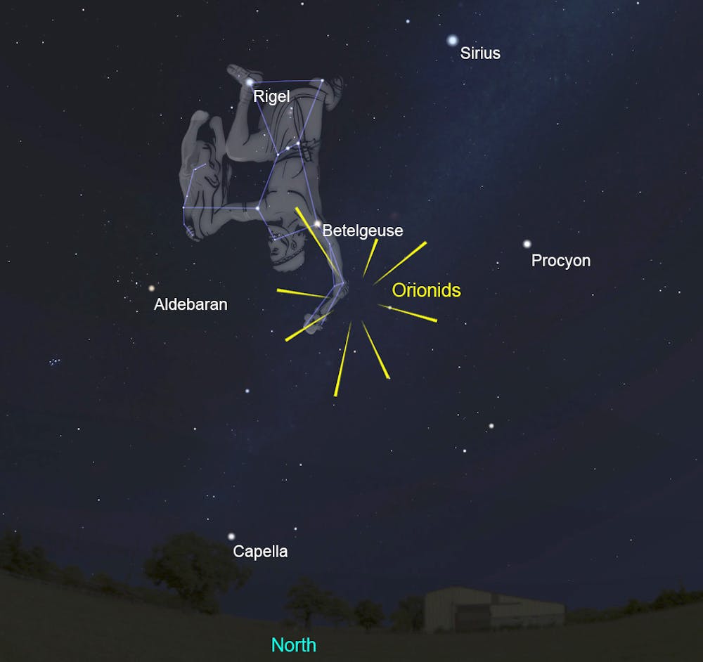
Orionids [N/S]
Active: October 2 – November 7
Maximum: October 21
ZHR: 20+
Parent: 1P/Halley
The Orionid meteor shower marks the second occasion the Earth encounters the stream of debris left behind by Halley’s comet each year.
In October, Earth passes farther from the centre of Halley’s debris stream than in May, with the result the observed rates for the Orionids are lower than for the Eta Aquariids. Despite this, the Orionids remain a treat for meteor enthusiasts in the northern autumn and southern spring.
The Orionids peak on October 21 but that maximum is often quite broad with activity hovering close to the peak rates for as much as a week around the maximum.
There is some evidence the peak rates vary over time, with a roughly 12 year periodicity, as a result of perturbations by the giant planet Jupiter (which orbits the Sun once every 12 years).
In the final years of the first decade of the 21st Century, the Orionids were markedly more active than expected, with maximum rates in the range 40-70. If the periodicity is real, then 12 years on from the peak of activity it is possible the Orionids will again put on a better than expected show.
So 2020 might well be an ideal year to look up and watch for fragments of Halley’s Comet vapourising high overhead.
Museums Victoria/Stellarium
The radiant rises just before local midnight, meaning the meteors are best observed in the early hours of the morning. The radiant reaches its highest altitude in the hours before dawn. The Moon will not interfere this year, setting in the early evening, long before the radiant rises.
Museums Victoria/Stellarium
Observers watching the Orionids are in for an extra treat. While the Orionids are active, so too are the Northern and Southern Taurid meteor showers. Where the Orionids are fast meteors, Taurids are slow, and often bright and spectacular.
Although the rates of both the Northern and Southern Taurids are lower than those of the Orionids (typically just ~5 per hour), their activity makes observations of the Orionids even more productive and exciting.
Geminids [N/S]
Active: December 4 – 17
Maximum: December 14, 12:50am UTC = 11:50am AEDT (NSW/ACT/Vic/Tas) = 8:50am AWST (WA) = 5:50pm EST (evening of December 13)
ZHR: 150
Parent: Asteroid 3200 Phaethon
The Geminids, which peak in mid-December, are truly a case of saving the best until last. The biggest of the year’s big three, the Geminids have, over the past few decades, been growing ever more active and spectacular, with recent years seeing rates in excess of 150 per hour.
For observers in northern Europe, the radiant is above the horizon relatively soon after sunset, meaning that the Geminids can readily be observed from around 8pm onwards.
The further south you travel, the later in the evening the radiant rises. For observers in Australia, the times at which the radiant appears above the horizon can be seen below.
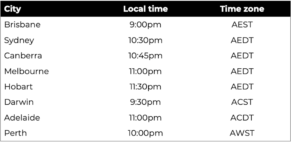
Author provided
As with all showers, the higher the radiant in the sky, the better the observed rates from the Geminids will be. The longer you watch, the better things will get.
Geminid meteors are of medium speed and often bright so they put on a spectacular show even in those years when moonlight interferes.
In 2020 the Moon will be new around this time so it will be possible to spend the entire night watching the Geminids without any interference from our nearest celestial neighbour.
The radiant reaches its highest at around 2am local time making the hours just after midnight the ideal time to catch the Geminids at their best.
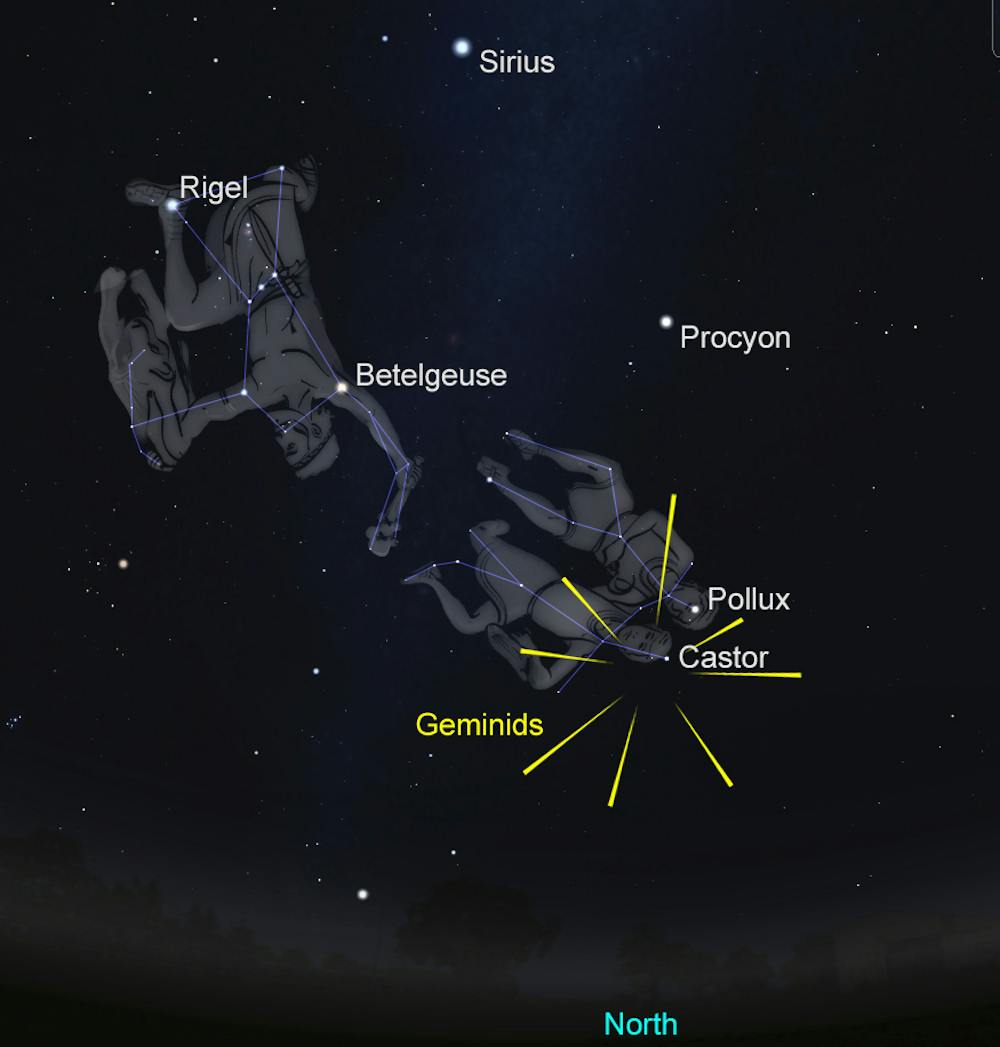
Museums Victoria/Stellarium
The Geminid peak is relatively broad -– with rates remaining high for at least 24 hours around the forecast maximum. Observers across the globe will be treated to a spectacular display from the shower in 2020.
So find a dark site, wrap up warm, and treat yourself to a night spent watching the year’s most spectacular display of natural fireworks.![]()
Jonti Horner, Professor (Astrophysics), University of Southern Queensland and Tanya Hill, Honorary Fellow of the University of Melbourne and Senior Curator (Astronomy), Museums Victoria
This article is republished from The Conversation under a Creative Commons license. Read the original article.
‘The size, the grandeur, the peacefulness of being in the dark’: what it’s like to study space at Siding Spring Observatory

Shutterstock
Cameron Furlong, The Conversation and Sunanda Creagh, The Conversation
How did our galaxy form? How do galaxies evolve over time? Where did the Sun’s lost siblings end up?
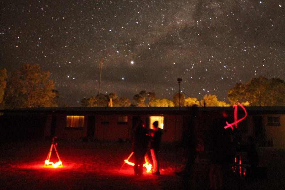
Three hours north-east of Parkes lies a remote astronomical research facility, unpolluted by city lights, where researchers are collecting vast amounts of data in an effort to unlock some of the biggest questions about our Universe.
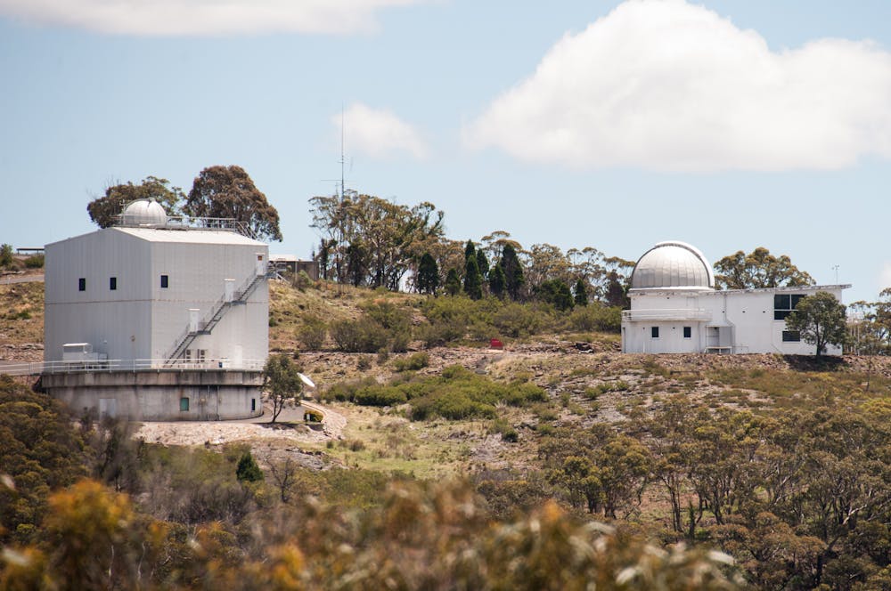
Siding Spring Observatory, or SSO, is one of Australia’s top sites for astronomical research. You’ve probably heard of the Parkes telescope, made famous by the movie The Dish, but SSO is also a key character in Australia’s space research story.
In this episode, astrophysics student and Conversation intern Cameron Furlong goes to SSO to check out the huge Anglo Australian Telescope (AAT), the largest optical telescope in Australia.
Shutterstock
Read more:
Darkness is disappearing and that’s bad news for astronomy
And we hear about Huntsman, a new specialised telescope that uses off-the-shelf Canon camera lenses – a bit like those you see sports photographers using at the cricket or the footy – to study very faint regions of space around other galaxies.
Cameron Furlong
Listen in to hear more about some of the most fascinating space research underway in Australia – and how, despite gruelling hours and endless paperwork, astronomers retain their sense of wonder for the night sky.
“For me, it means remembering how small I am in this enormous Universe. I think it’s very easy to forget, when you go about your daily life,” said Richard McDermid, an ARC Future Fellow and astronomer at Macquarie University.
“It’s nice to get back into it to a dark place and having a clear sky. And then you get to remember all the interesting and fascinating things, the size, the grandeur and the peacefulness of being in the dark.”
New to podcasts?
Podcasts are often best enjoyed using a podcast app. All iPhones come with the Apple Podcasts app already installed, or you may want to listen and subscribe on another app such as Pocket Casts (click here to listen to Trust Me, I’m An Expert on Pocket Casts).
You can also hear us on Stitcher, Spotify or any of the apps below. Just pick a service from one of those listed below and click on the icon to find Trust Me, I’m An Expert.


Read more:
Trust Me, I’m An Expert: what science says about how to lose weight and whether you really need to
Additional audio
Kindergarten by Unkle Ho, from Elefant Traks.
Lucky Stars by Podington Bear from Free Music Archive.
Slimheart by Blue Dot Sessions from Free Music Archive.
Illumination by Kai Engel from Free Music Archive.
Phase 2 by Xylo-Ziko from Free Music Archive.
Extra Dimensions by Kri Tik from Free Music Archive.
Pure Water by Meydän, from Free Music Archive.
Images
Shutterstock
Cameron Furlong
Read more:
Antibiotic resistant superbugs kill 32 plane-loads of people a week. We can all help fight back
![]()
Cameron Furlong, Editorial Intern, The Conversation and Sunanda Creagh, Head of Digital Storytelling, The Conversation
This article is republished from The Conversation under a Creative Commons license. Read the original article.

You must be logged in to post a comment.